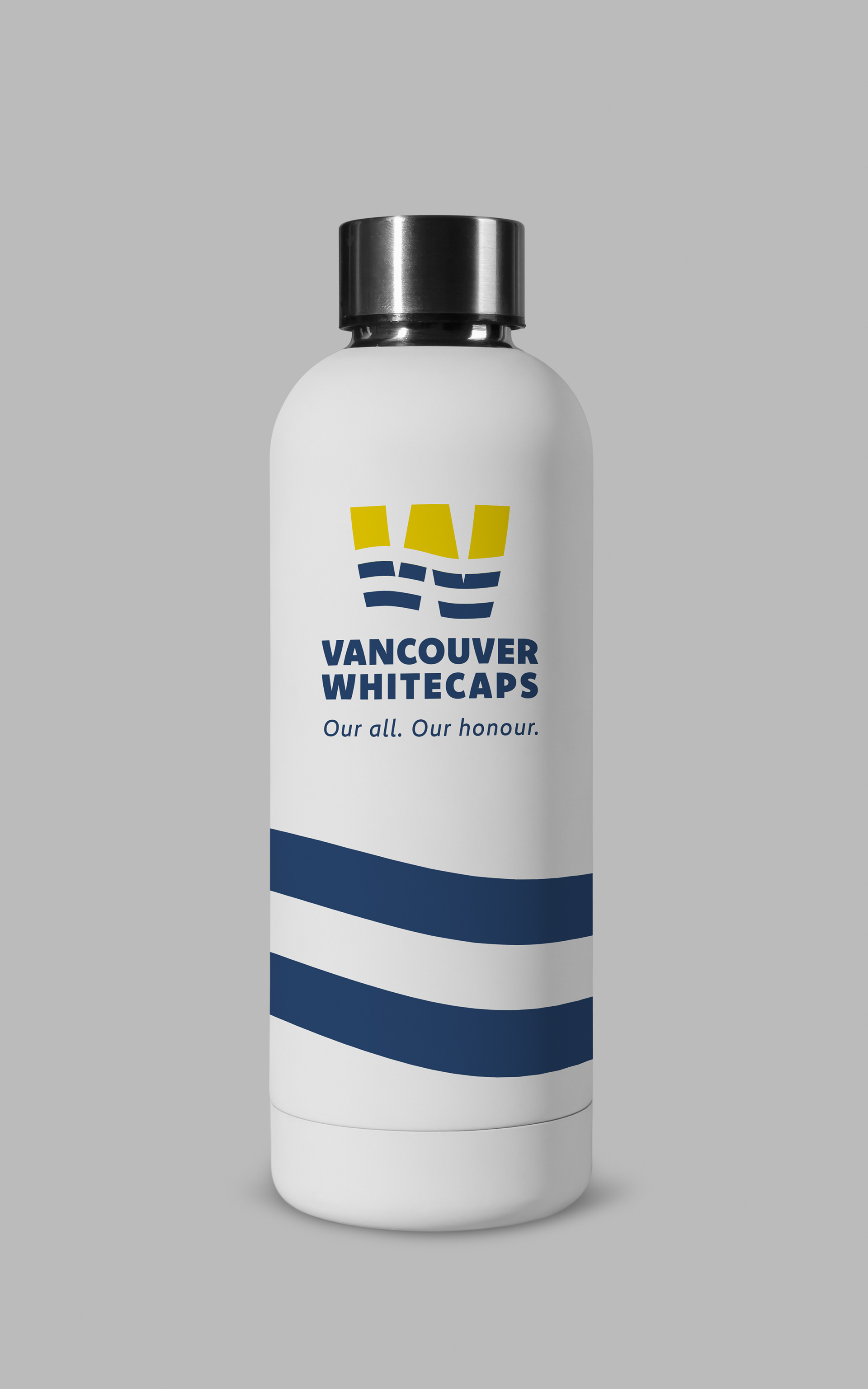

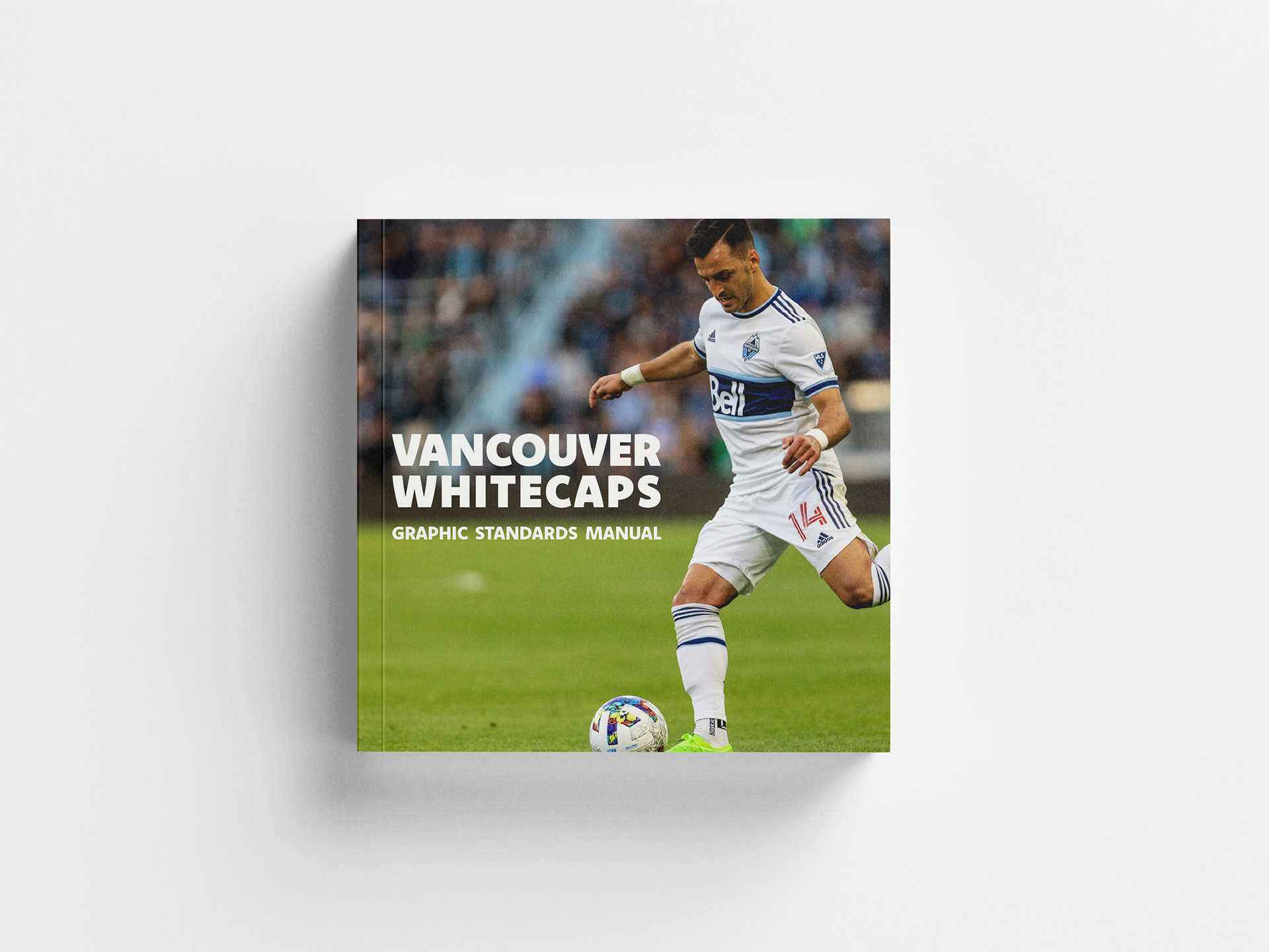
In my fourth-year branding course, I was tasked to re-brand the Vancouver Whitecaps. I began the design process by establishing a set of brand values, namely Community, Competition, and Honour, which served as guiding principles throughout the project.
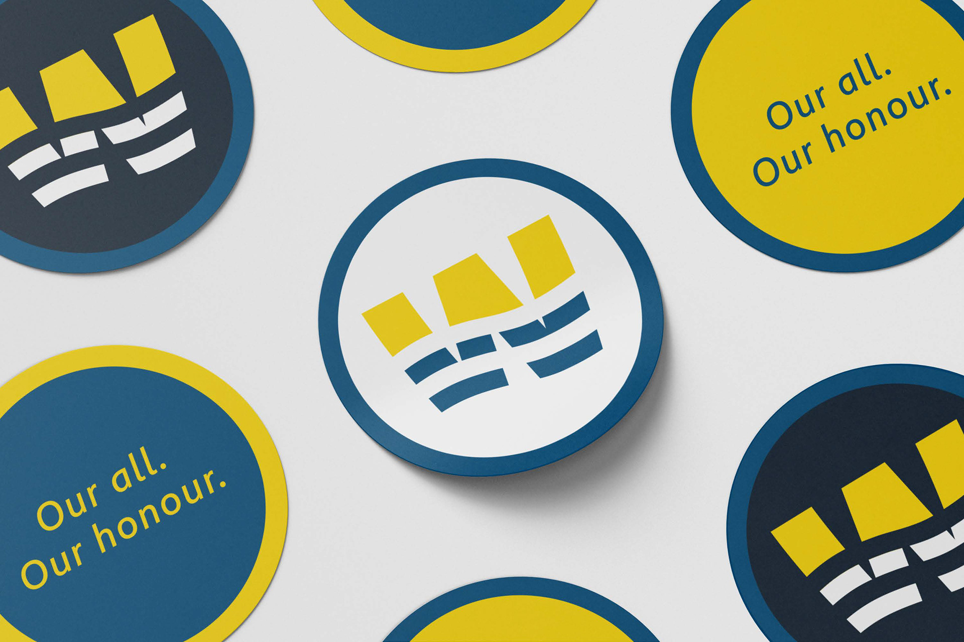
Designing a new logo began began with a few weeks of sketching and ideation. Throughout this process I had the goals of simplifying the logo to an identifiable mark and allowing the whitecaps wave aspect of the brand to shine through.


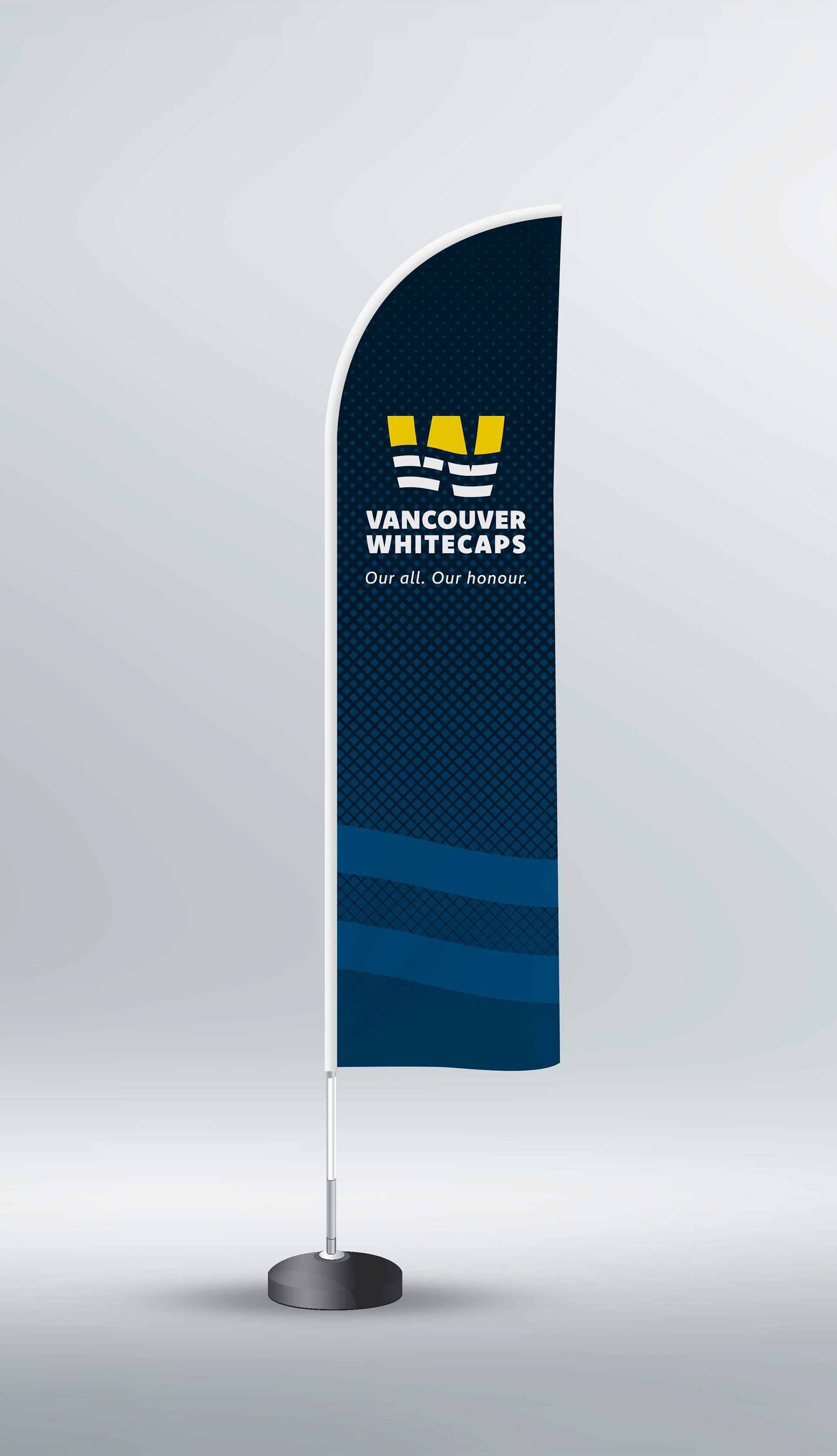
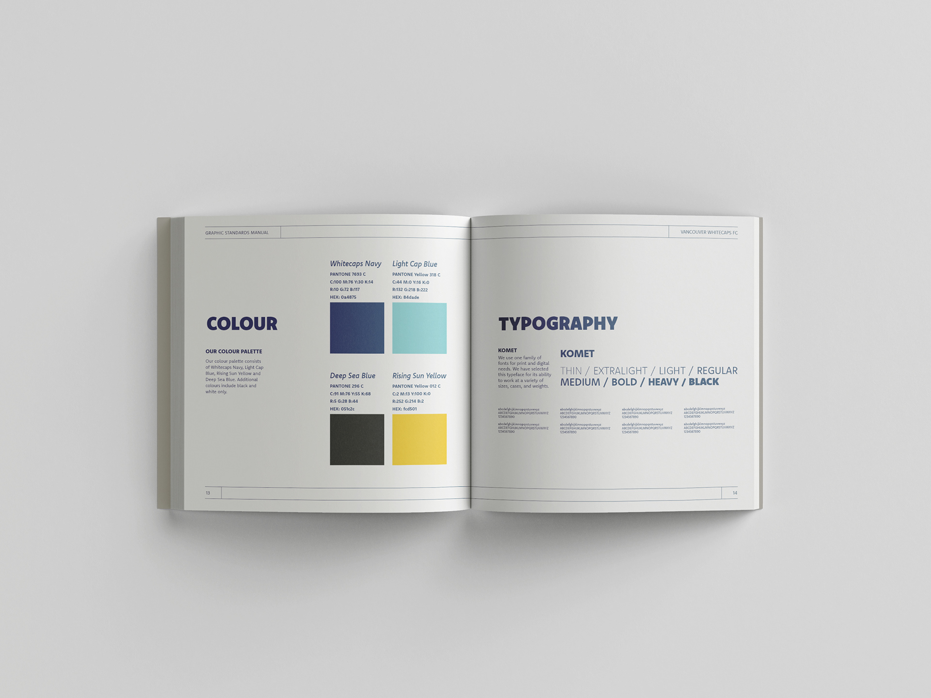
To ensure consistency across all branding materials, I created a set of brand guidelines that would assist other designers in implementing the newly established branding. The guidelines outlined specific instructions on the appropriate use of colour, typography, photography, and the different logos.

The Vancouver Whitecaps currently do not have an app so I thought it would be a great addition to their marketing mix. The app includes videos, news, standings, the team roster, merchandise and tickets for fans to stay up to date with their favourite team.

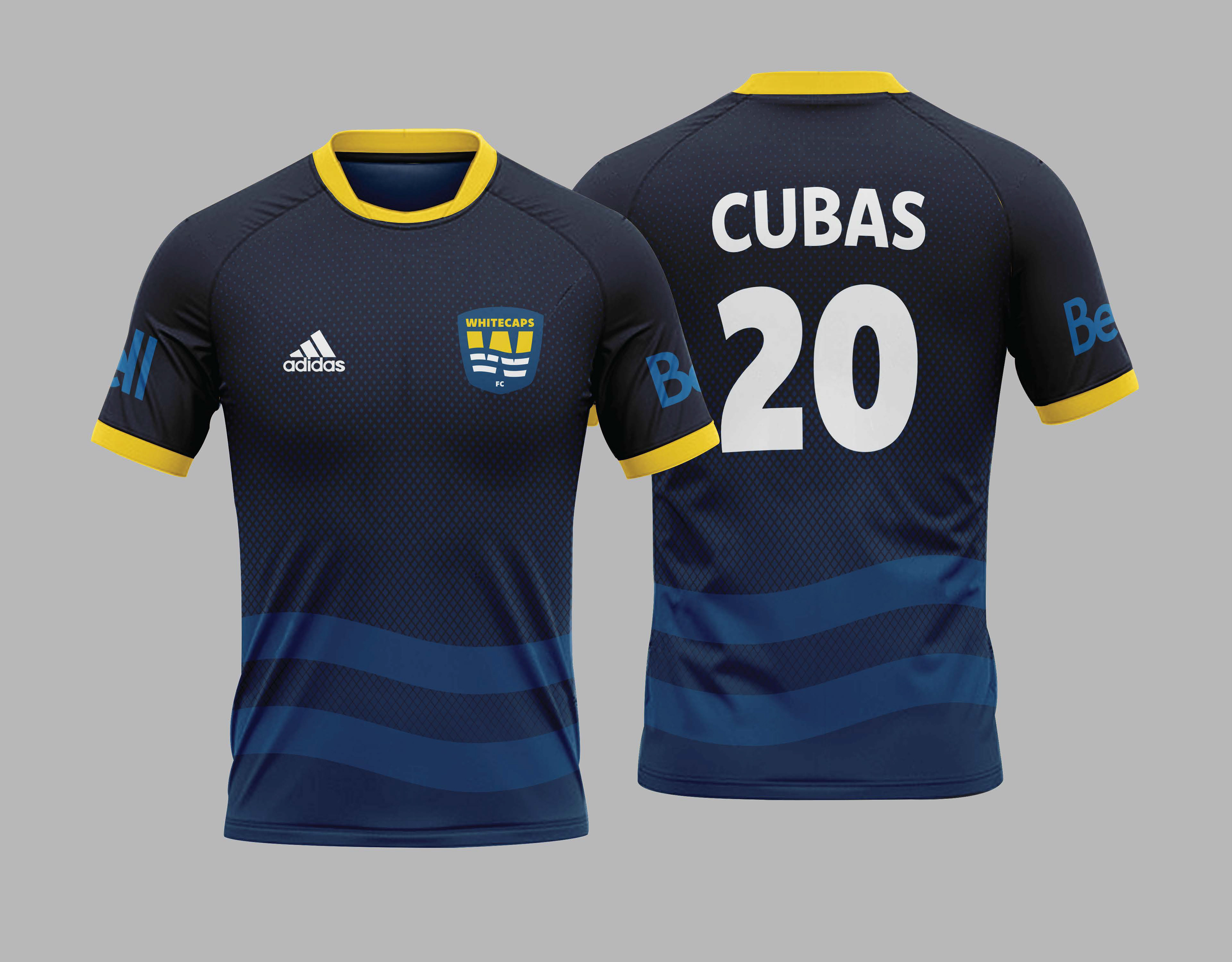
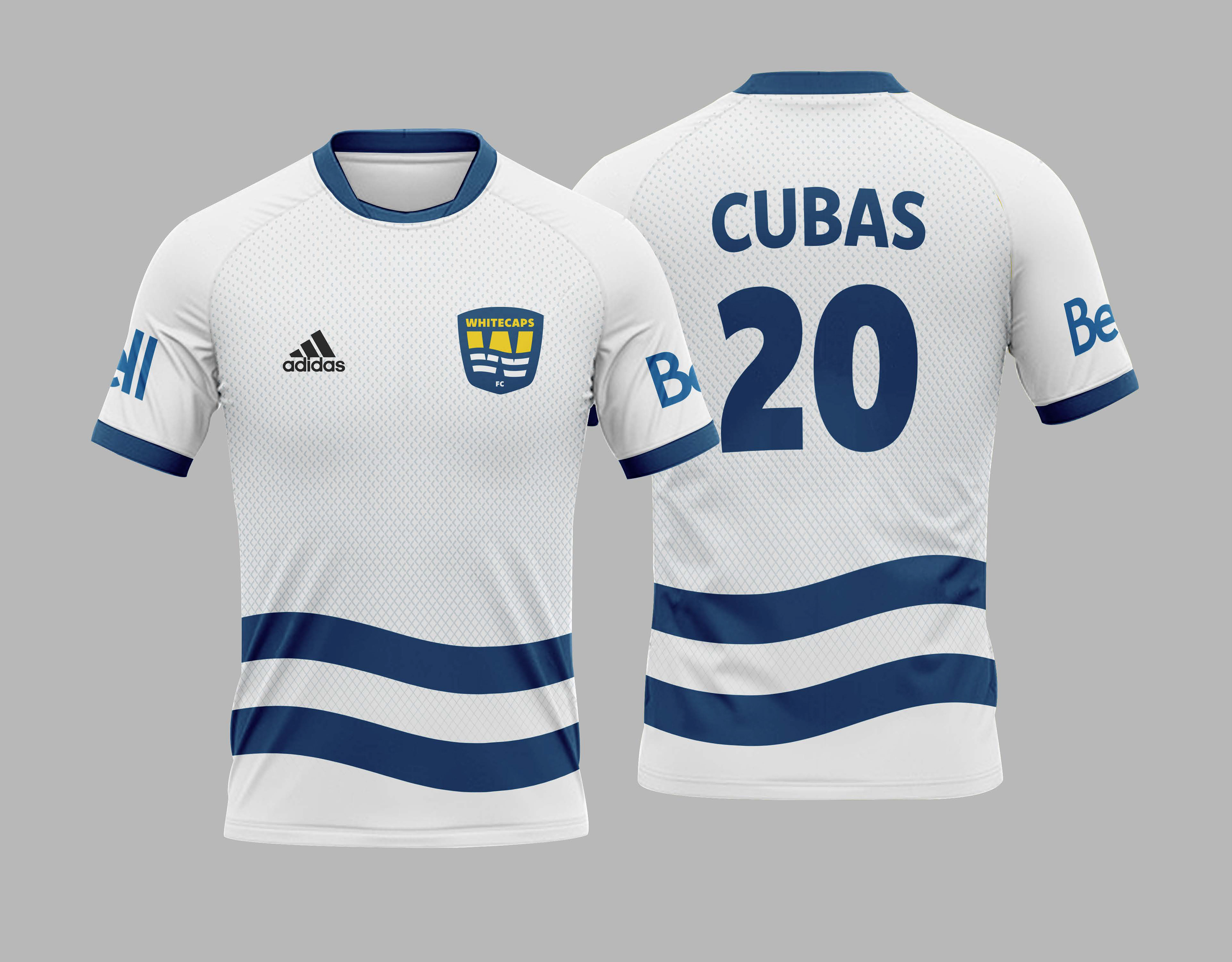
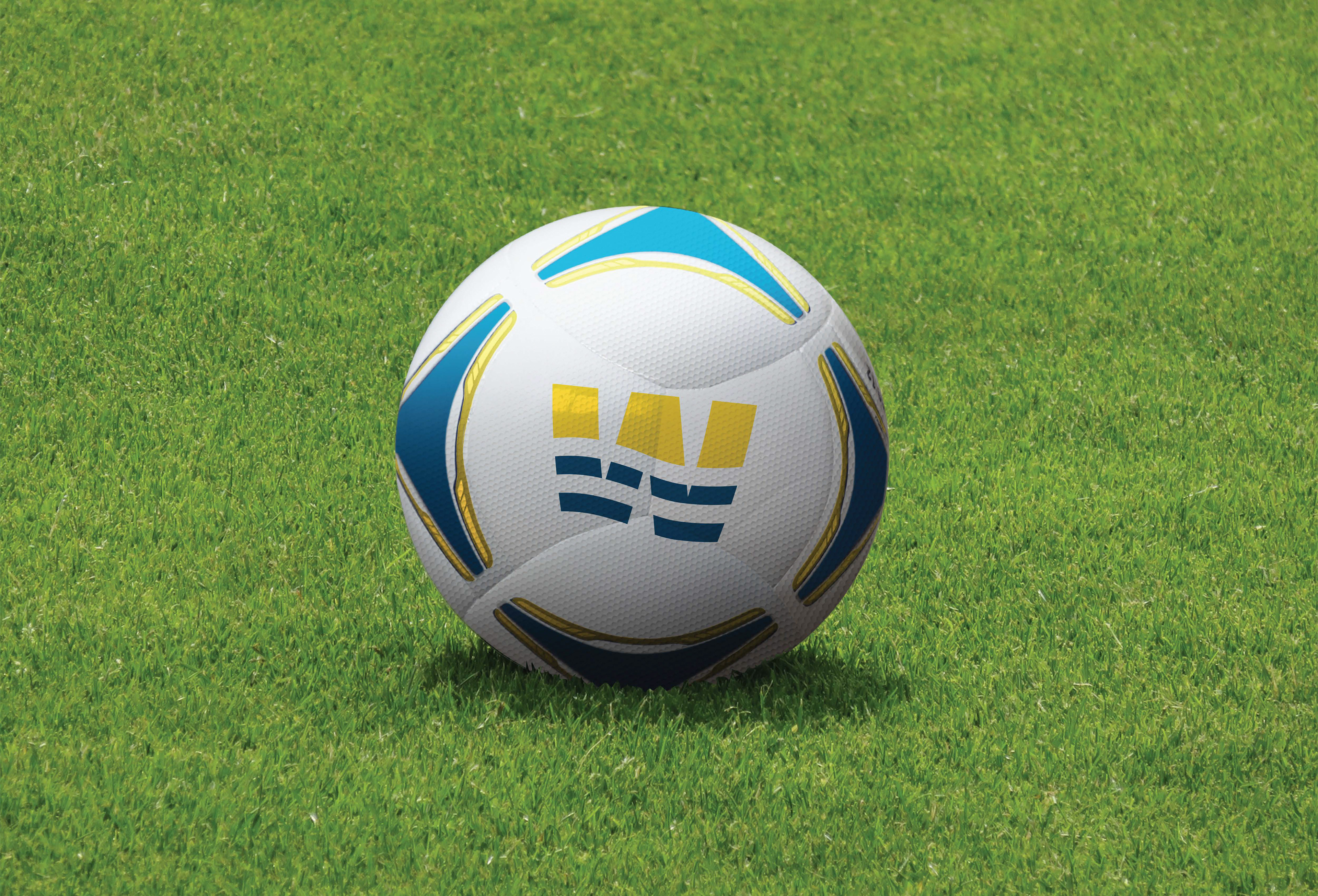
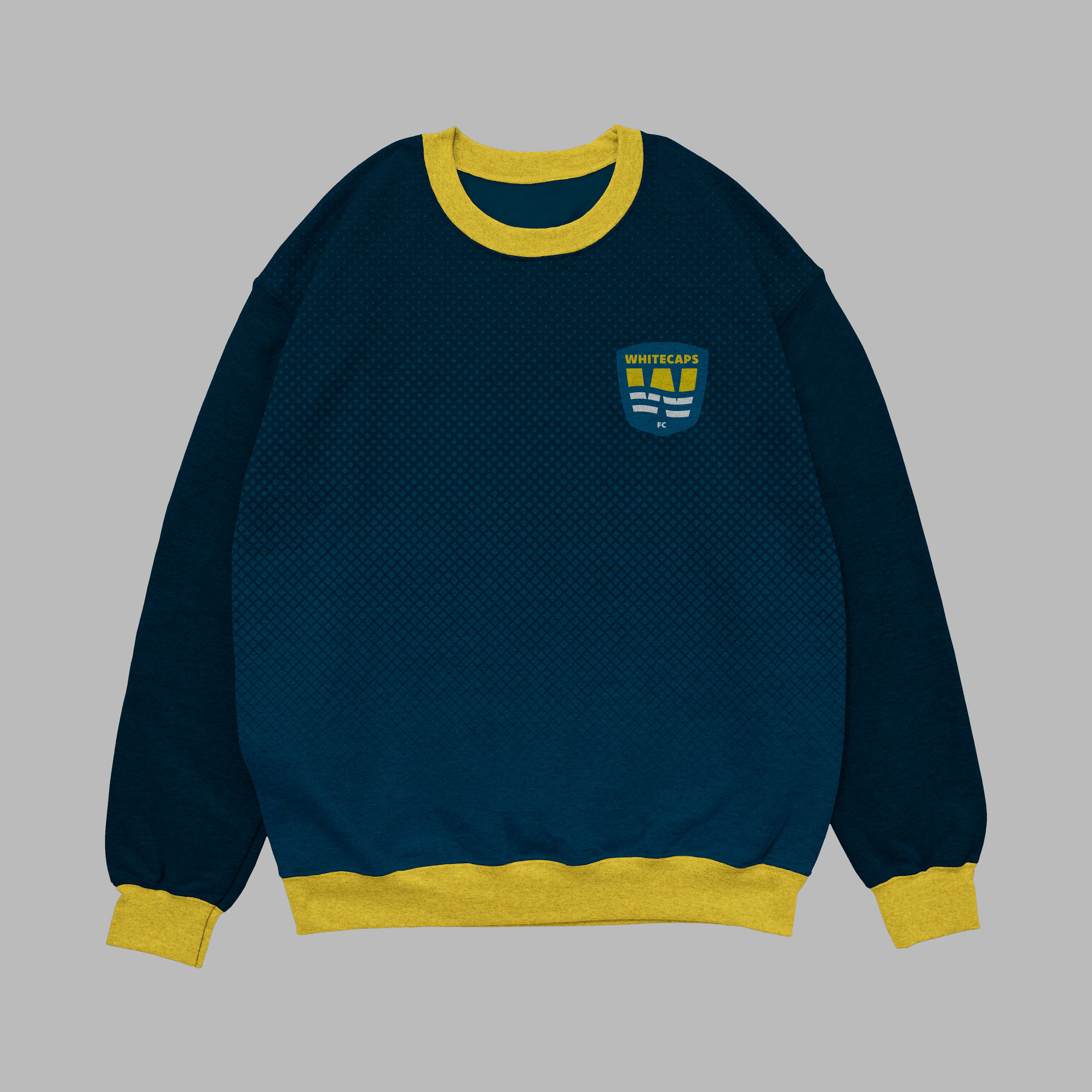
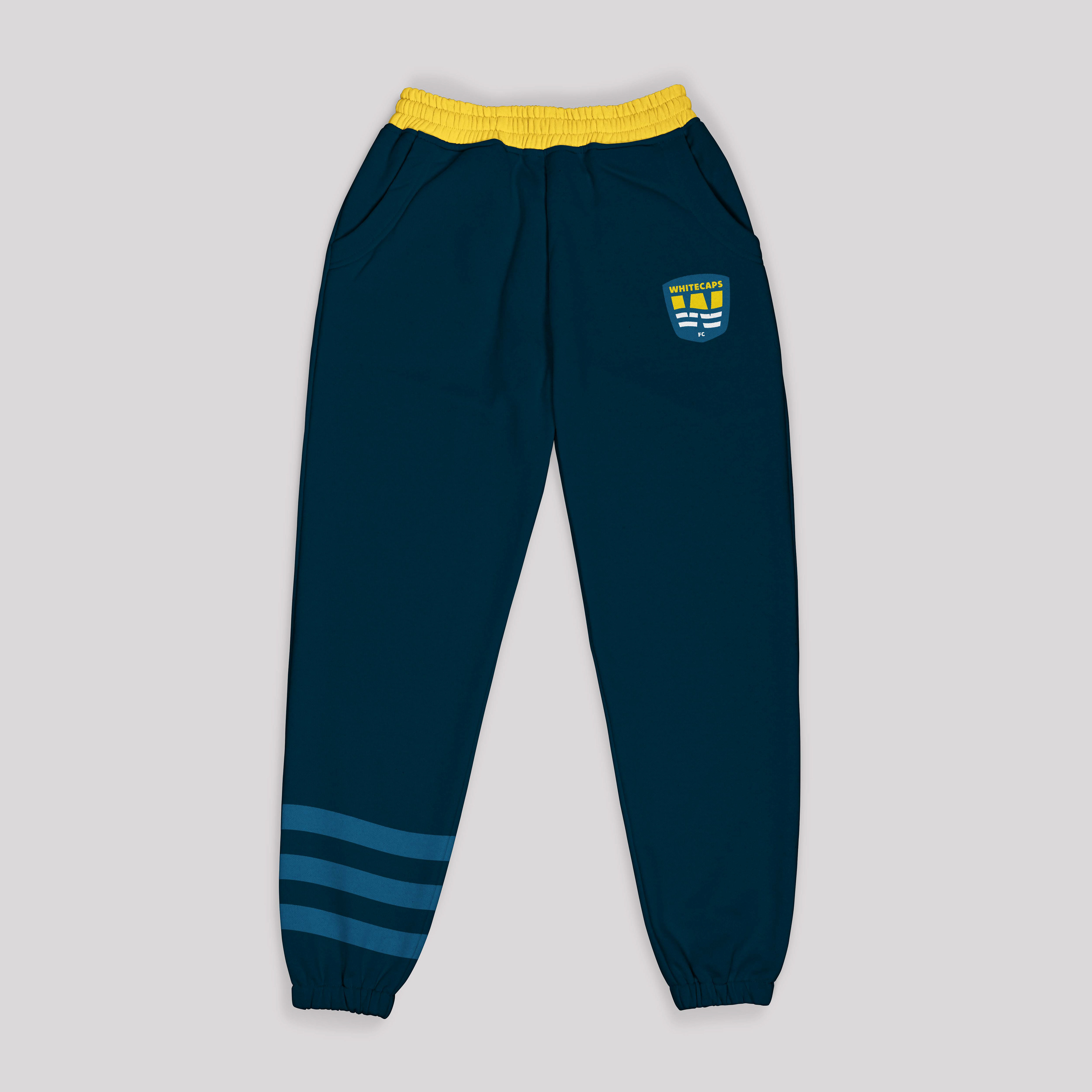
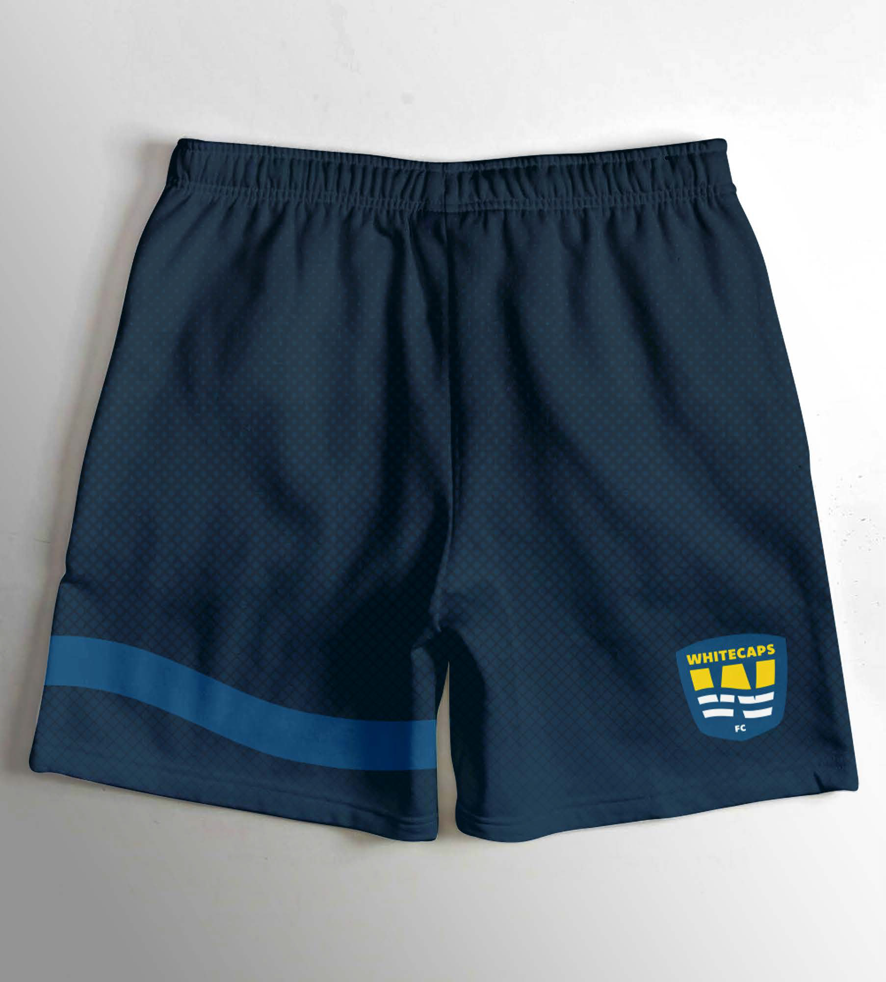
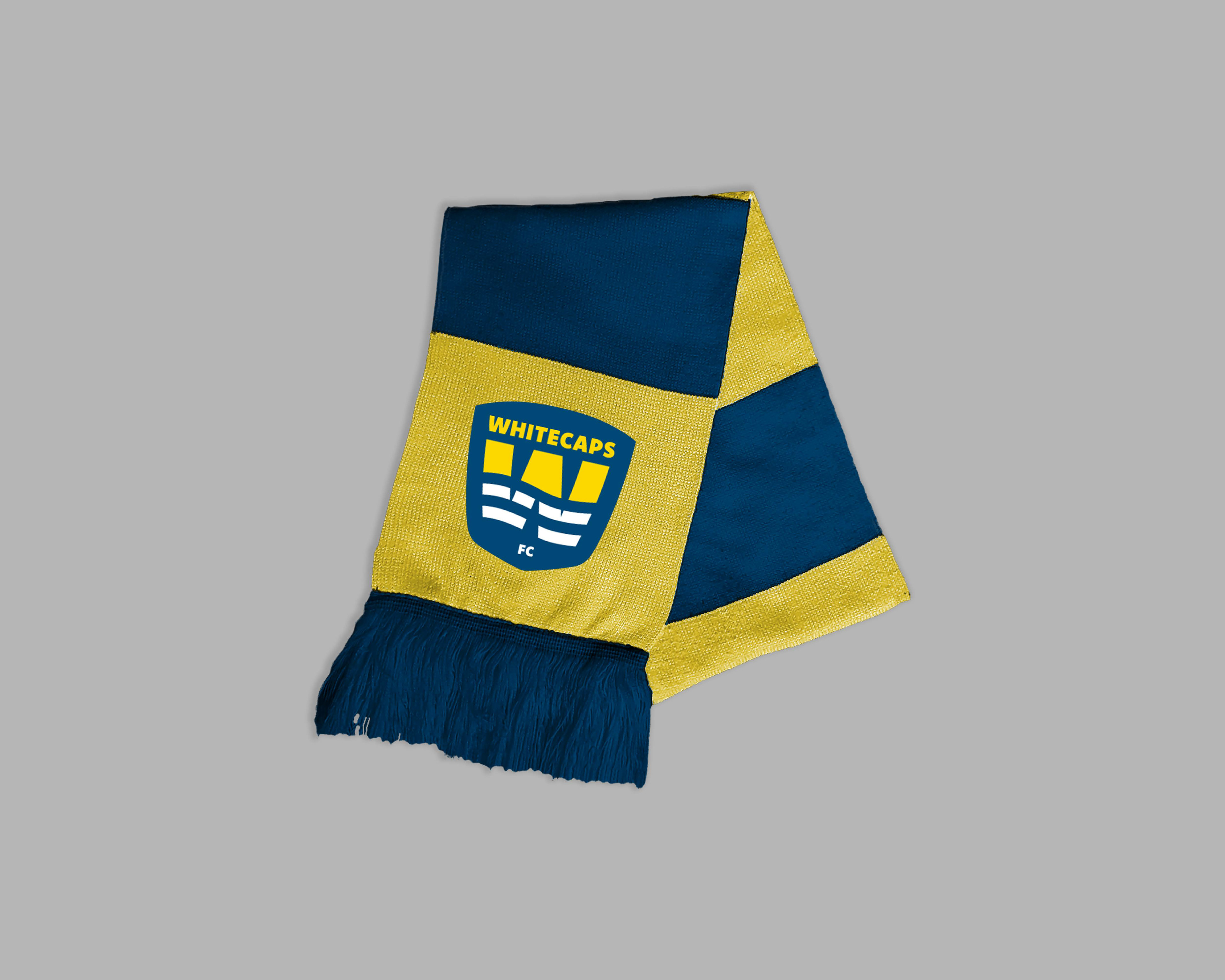
Utilizing the wave from the logo I created accompanying assets like jerseys, a ticket and field supplies. As one of the brand values is community I created a family day poster to showcase the importance of youth in sport and fostering the next generation of soccer players.